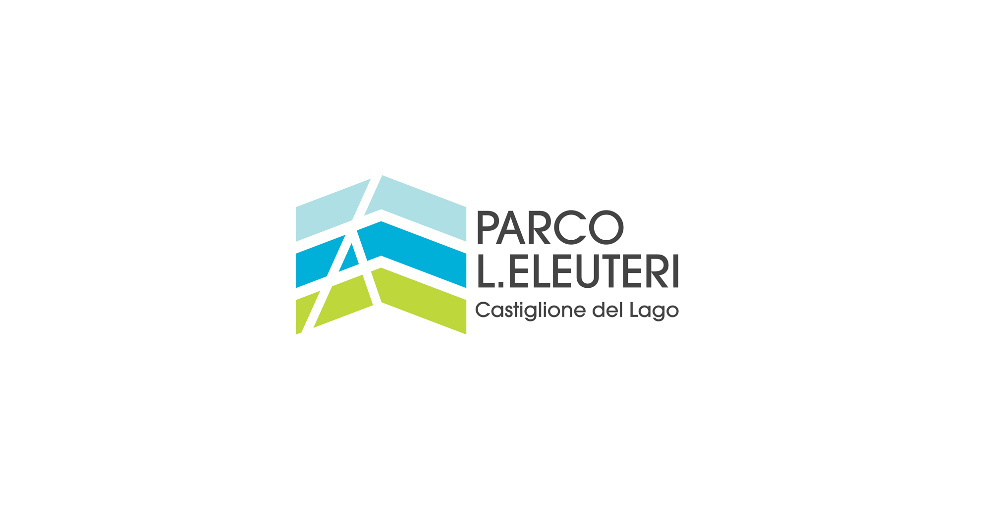
The idea of the logo proposed for the competition wants embrace the program of environmental enhancement , historical and architectural of “L. Eleuteri” ex airport of Castiglione del Lago and the proposed “open air museum “. Although the first building to be fish will be the aquarium ” Park House”, the logo and the name they want to identify the entire area of “former airport Leopoldo Eleuteri” of Castiglione del Lago.
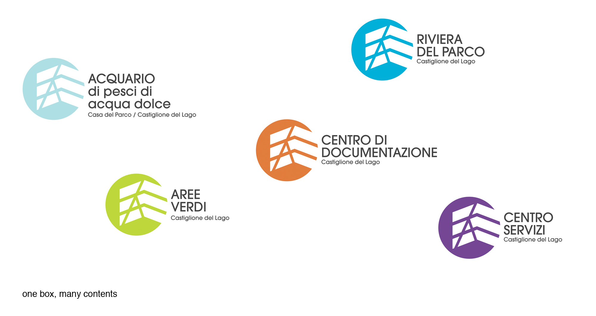
In it are included the Trasimeno lake, the outdoor areas of the former aereoporto, ” the aquarium of lake fish” and the subsequent redevelopment as the “documentation center”.
The choice of the name “Parco L. Eleuteri” and has been dictated by idea of identify the entire area of the former airport buildings and outbuildings such as “Park” as an open space, a meeting place and a variety of activities such as the annual event “Coloriamo I cieli”, a kites festival, and also for indicate the large natural area for the whole of the community of Castiglione del Lago and the many tourists who visit this location.
The shape of the logo look back at the “genius loci”of the area. In fact, it is inspired by elements that identified the past and present uses . In particular, the military aviation graphic sign are translated in a more simplified image with colourful that wants to make them look like kites that at list once at year are colouring the former airport sky. The lines cross mark on the logo an “A” as Airport to still refer to the Military Airport .
To keep the historical memory of the area the name will conserve the dedication of the Park to Leopold Eleuteri, known aviator from Umbria region.
The three colours of the logo will identify the different parts of the Park: The light blue emphasizes the presence of Lake Trasimeno. Blue wants to identify the presence of Aquarius, but also refer to future projects related to the enhancement of the Park and the green colour referring to the park with trees and green areas for outdoors activities.
In response to the competition request for “one logo with many contents” we propose a variation of the logo making assigned different colours according to their functions. This is also to ensure relevance and a logic for all projects that will be realized in the future .
The logo is therefore wants ensure recognisability, visibility and uniqueness through the use of shapes and colours that identify the entire area of the former airport “L. Euleuteri” of Castiglione del Lago.